What’s the #30DayChartChallenge?
The #30DayChartChallenge is a data visualization challenge with the aim to create a data visualization on a certain topic for each day of April. Anyone is welcome to contribute, no matter which data source or tool is used to create the visualizations.
The challenge is inspired by the #30DayMapChallenge which was initiated by Topi Tjukanov in 2019. I did participate back then and while it was exhausting to come up with a map every da, I learned so much in no time: where to find data, how to work with different spatial data sets, who’s out there doing awesome stuff, and what other tools besides QGIS and R use to create maps of all sorts. I actually finished 28 out of 30 maps and some are still among my favorite personal visualizations. (Read the blog post here.)
During the second edition in 2020, Dominic Royé proposed to organize something similar but with the focus on all kinds of chart types not maps in particular. And when Dominic tagged me in this discussion, I was all-in!
Begin of 2021, Dominic and I sat down (remotely) to organize the event and brainstorm ideas for topics. We went for and back how open to phrase the topics. We also had the idea to use only chart types as prompts and/or restrict the challenge to a single data set. In the end, we decided to allow for a lot of freedom, also with the goal to see the variety of interpretations by participants of a particular keyword:
![]()
If you want to learn more about the challenge, our learning, and some of my favorite contributions, watch the talk I gave at the DataVis Lisboa meeting (Slides).
My Goal for the #30DayChartChallenge
Given that Dominic and I also had to take care some organizational tasks and I also have some other job(s) that need to be done as well, the realistic me never anticipated to contribute to all 30 days. Well, I felt very challenged to give it a try but after contributing to the first eight days in a row I had to tackle the other topics a bit more slowly.
No matter how many I may manage to finish, one of my main goals was to use a variety of tools. In the #TidyTuesday challenge, I am always bound to ggplot2—and don’t get me wrong, I still love it!—but I was really looking forward to having the freedom to try something else. To get out of my comfort zone and finally try some other tools such as Figma, DataWrapper, Flourish, RAWGraphs, Excel. (Well, I am aware for many going from chart builder tools to R would be the challenge but for me it’s vice versa…)
My Contributions to the #30DayChartChallenge
Comparisons
Day 1: Part-to-Whole
Tool: Microsoft PowerPoint
 Alternative version 1 | Alternative version 2
Day 2: Pictogram
Tool: Microsoft Word
 German version
Day 3: Historical
Tool: ggplot2
A tribute to the first known statistical graph:
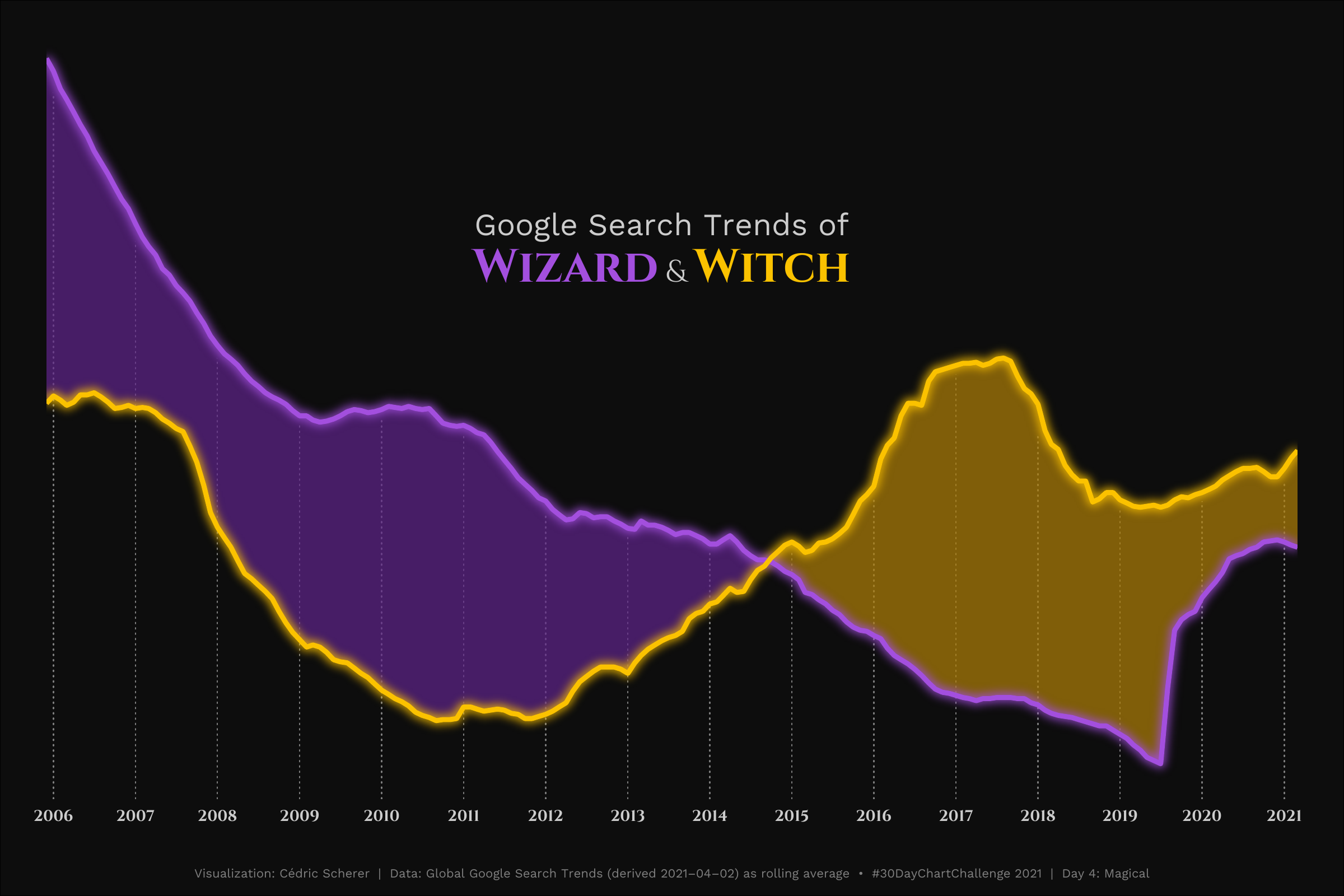
Day 4: Magical
Tool: ggplot2
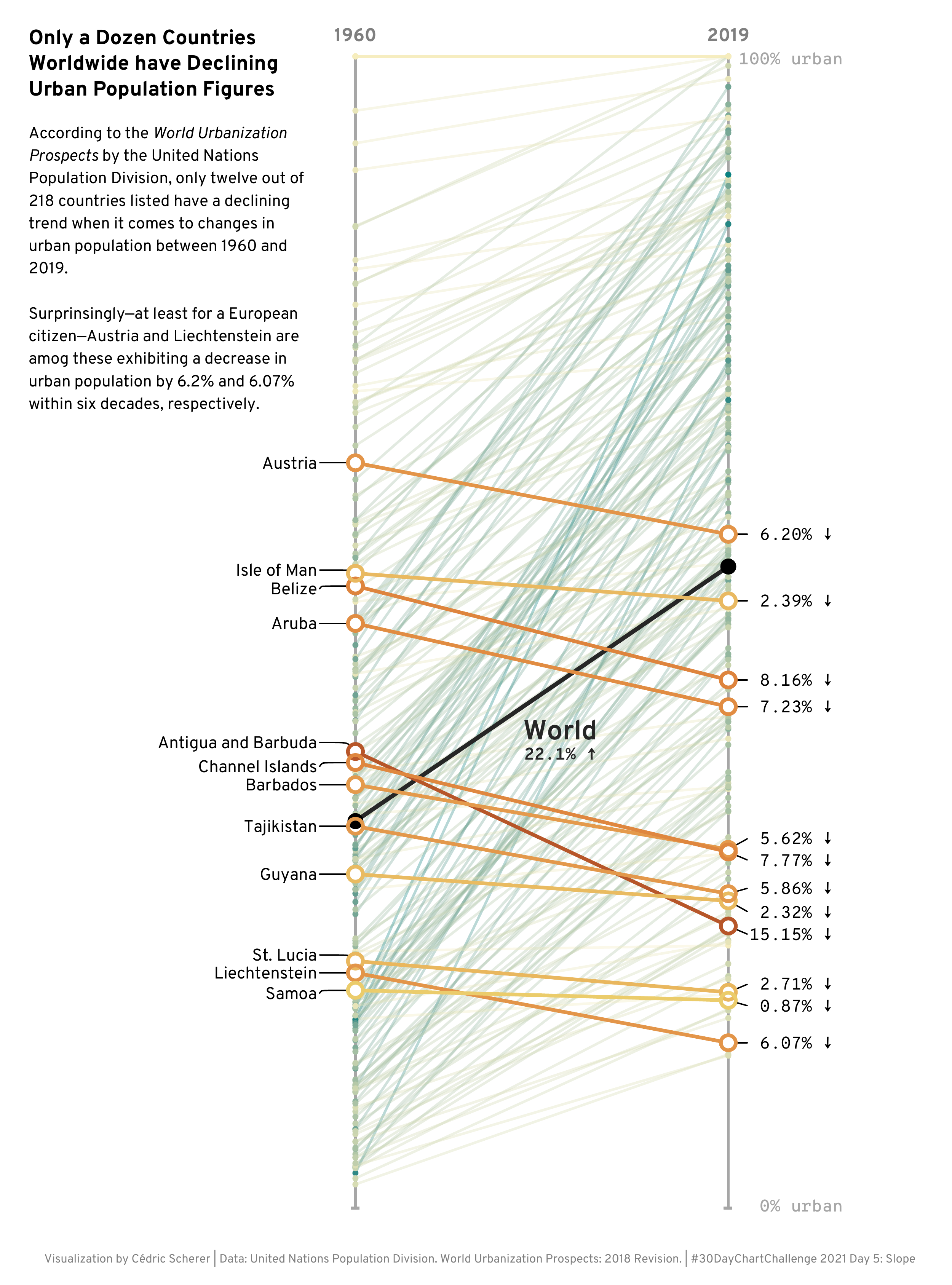
Day 5: Slope
Tool: ggplot2
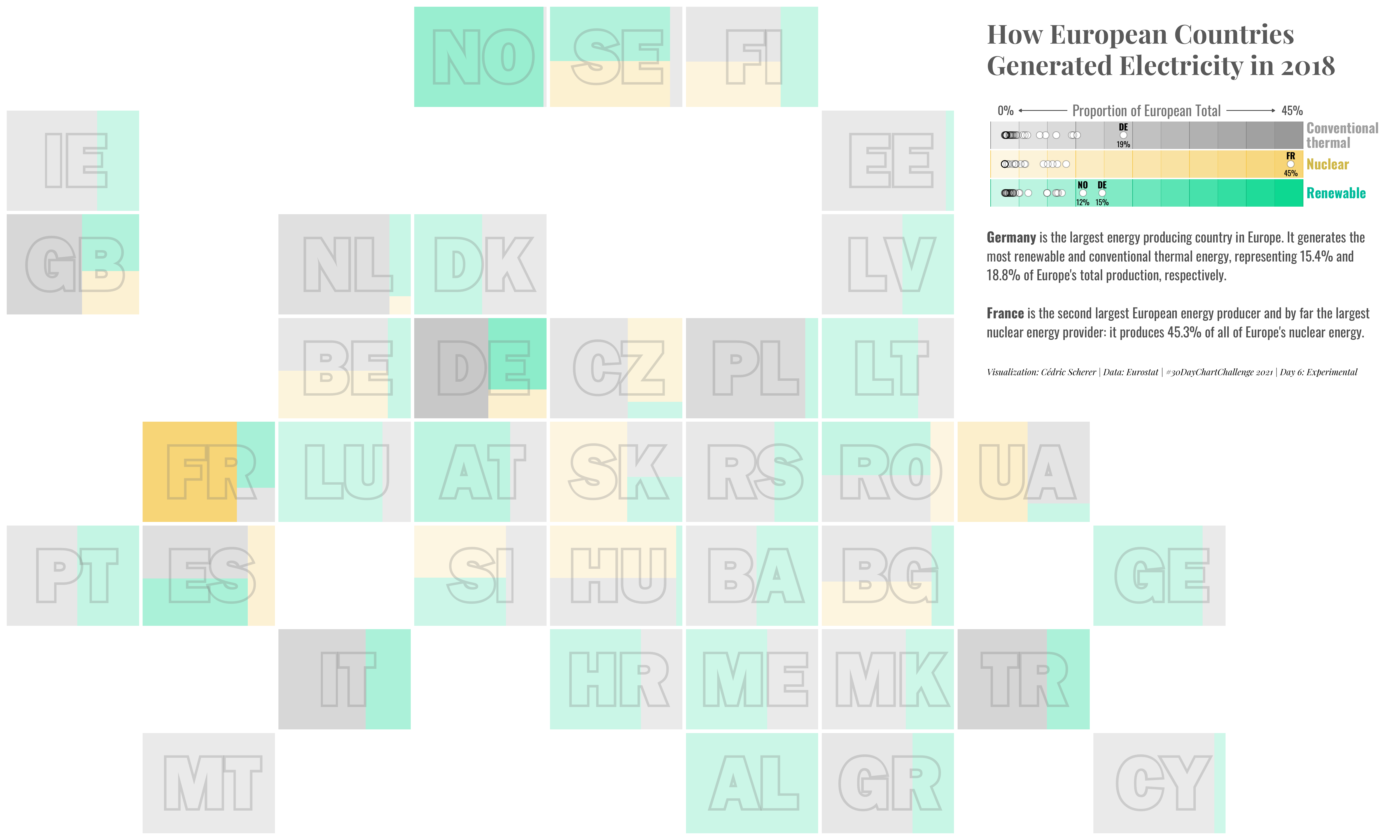
Day 6: Experimental
Tool: ggplot2
Distributions
Day 7: Physical
Tools: amcharts and Figma
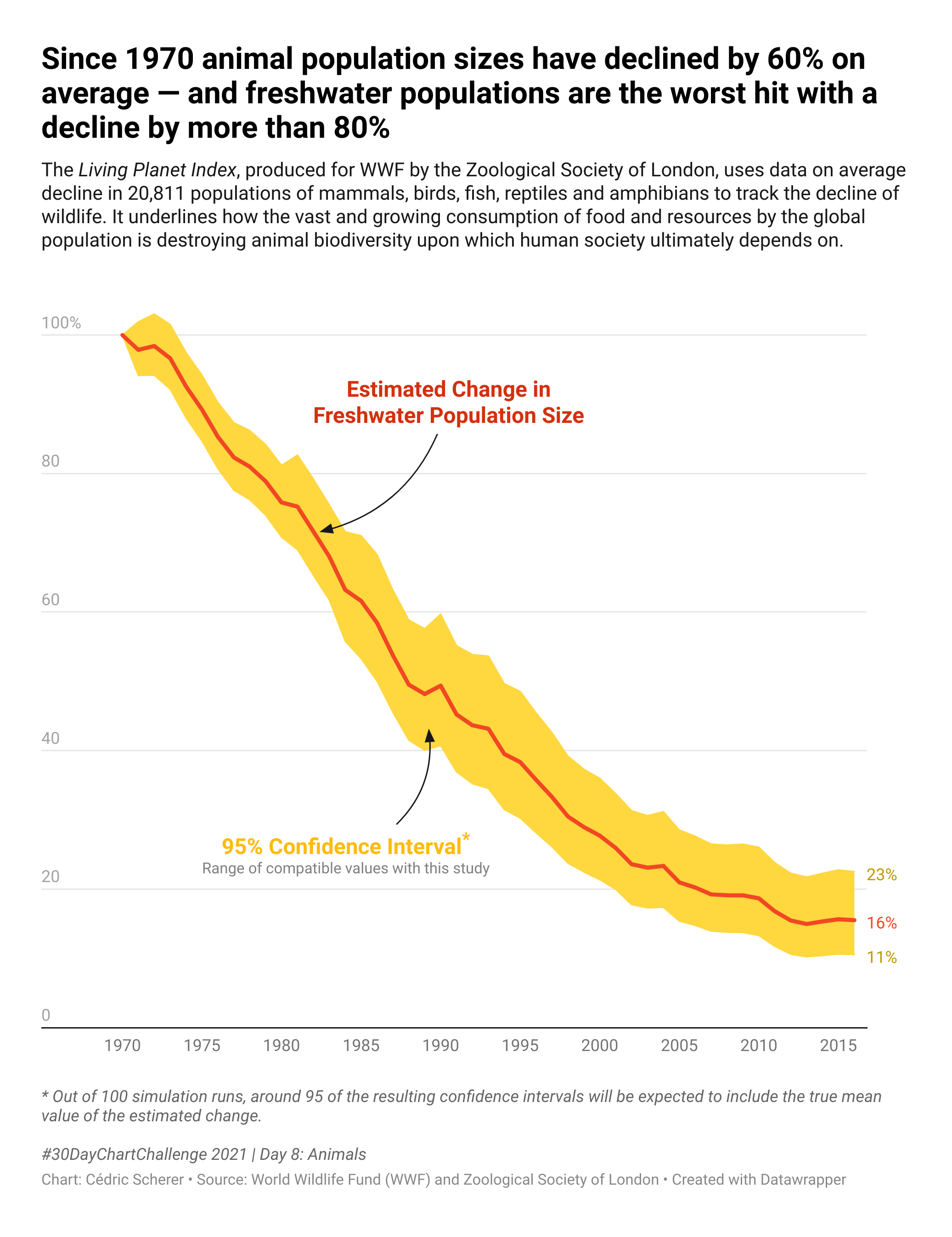
Day 8: Animals
Tool: DataWrapper
Static version | Alternative version with linear scale
Day 10: Abstract
Tool: ggplot2
 Alternative version 1 | Alternative version 2
Relationships
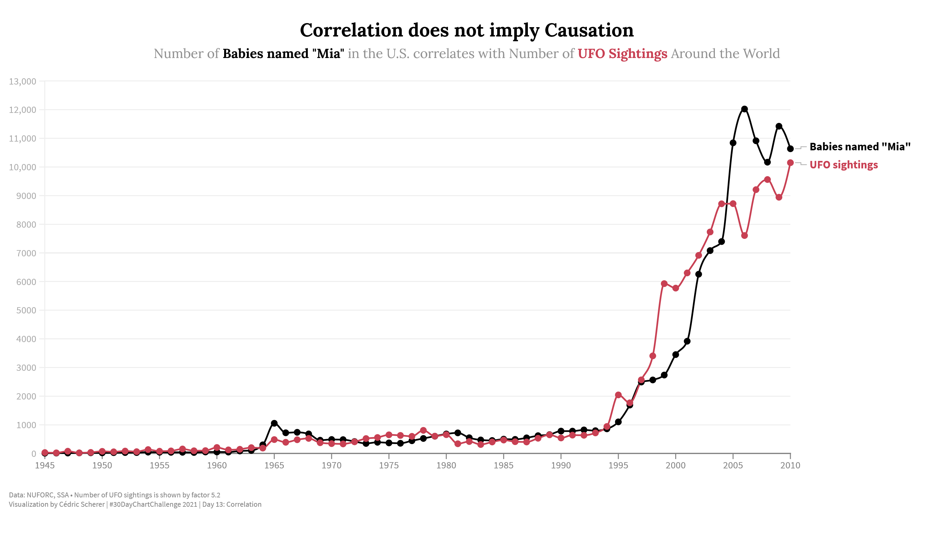
Day 13: Correlation
Tool: Flourish

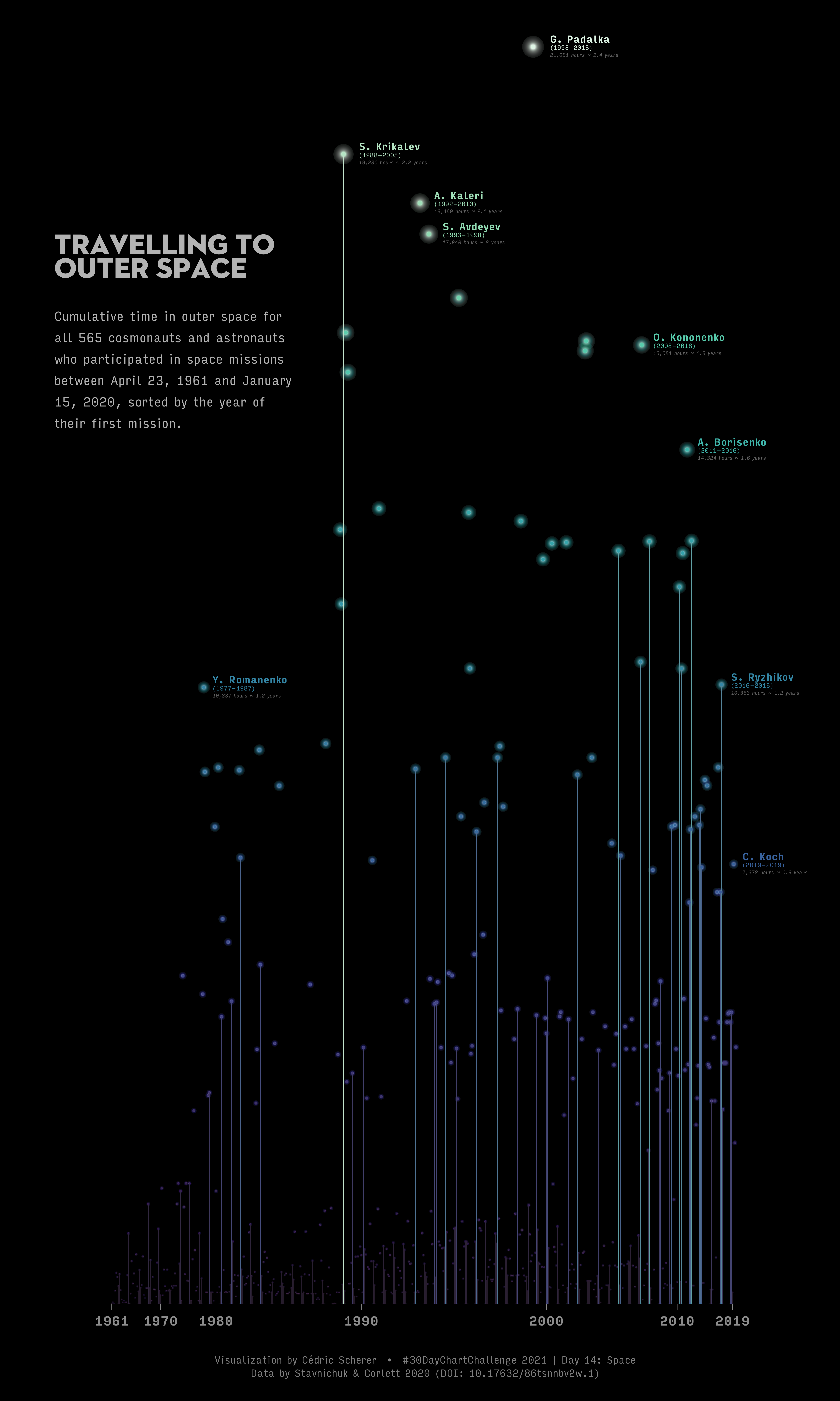
Day 14: Space
Tool: ggplot2
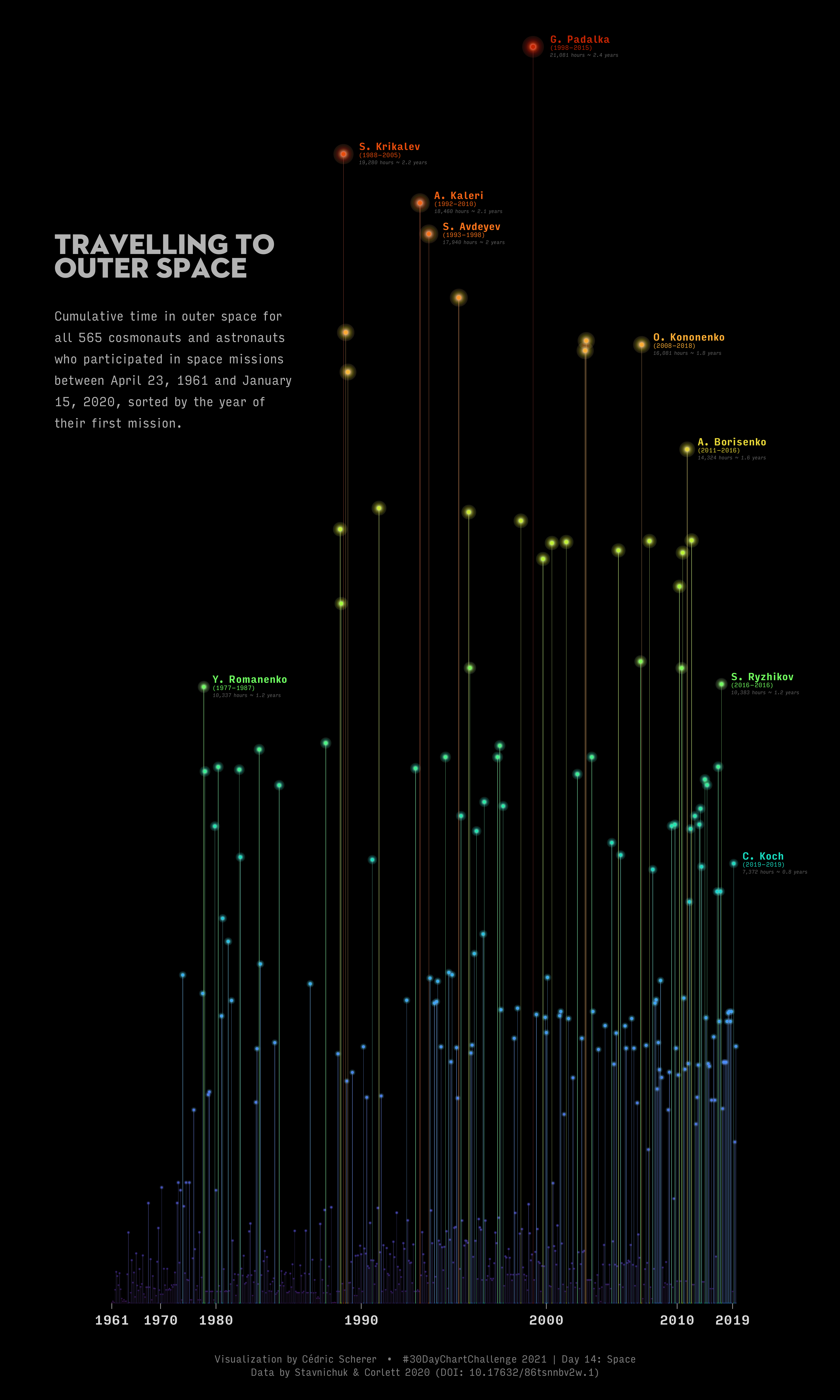 Alternative version 1 | Alternative version 2 | Alternative version 3
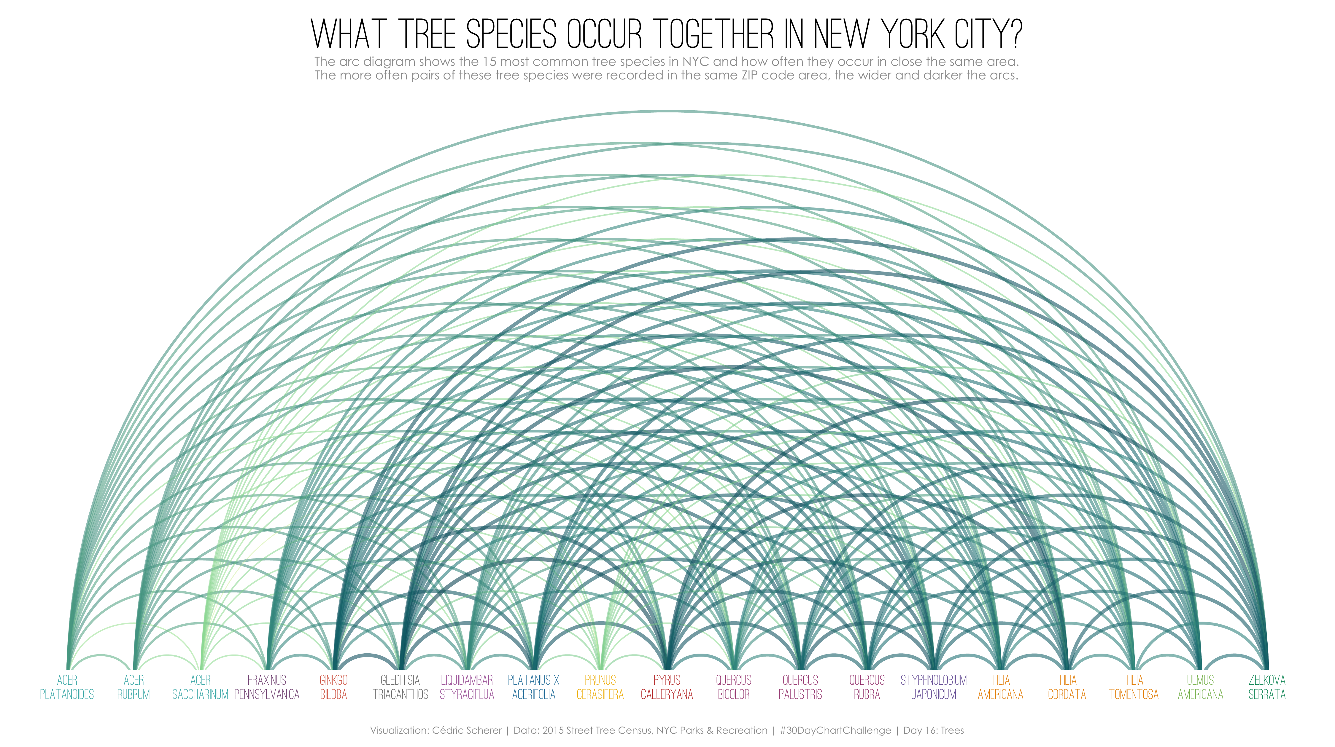
Day 16: Trees
Tool: ggplot2
Day 17: Pop Culture
Tool: ggplot2
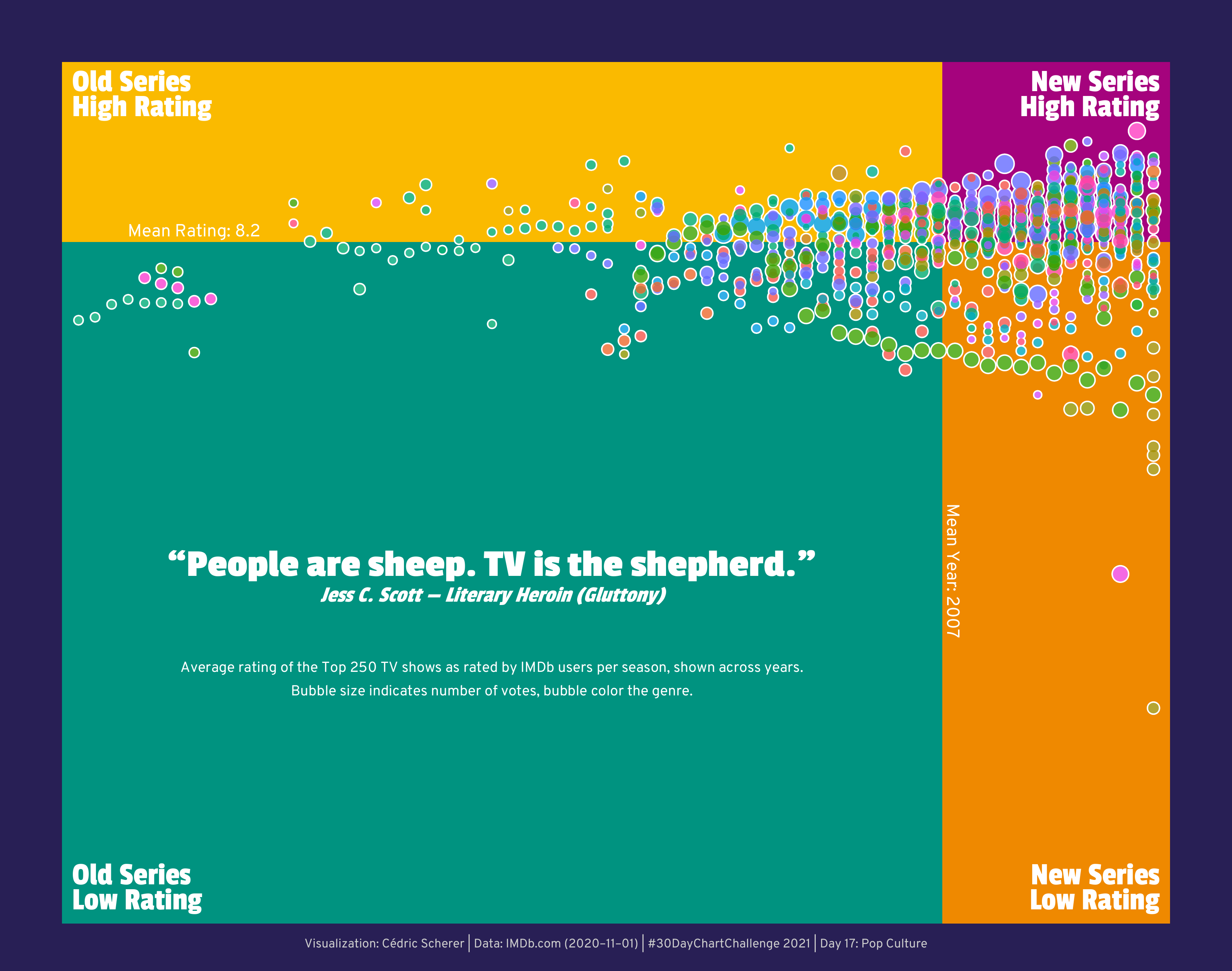 Alternative version showing median values
Timeseries
Day 19: Global Change
Tools: ggplot2 and Figma
Day 20: Upwards
Tool: ggplot2
 Alternative version with larger labels
Day 22: Animation
Tool: Flourish
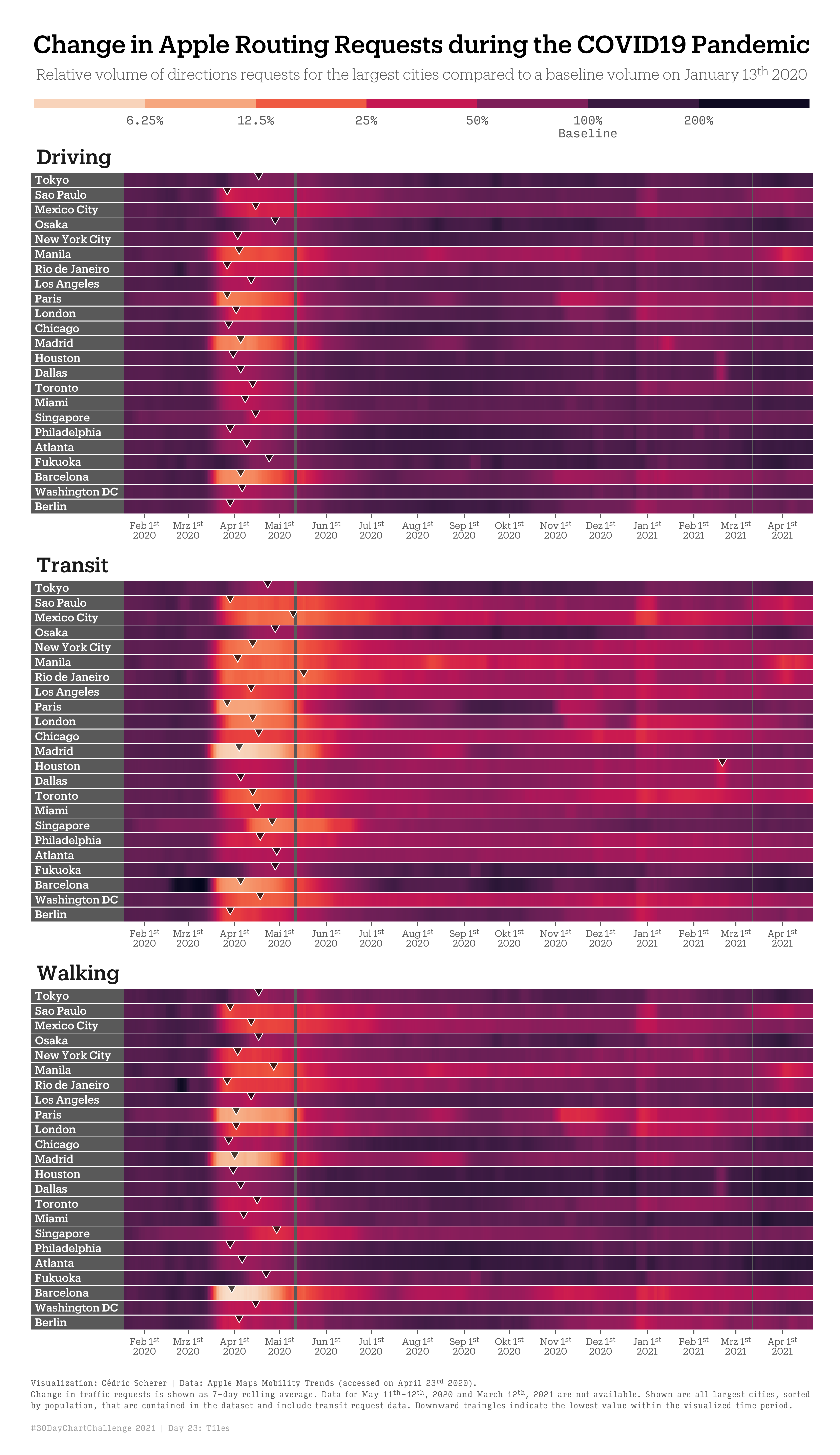
Day 23: Tiles
Tool: ggplot2
Uncertainties
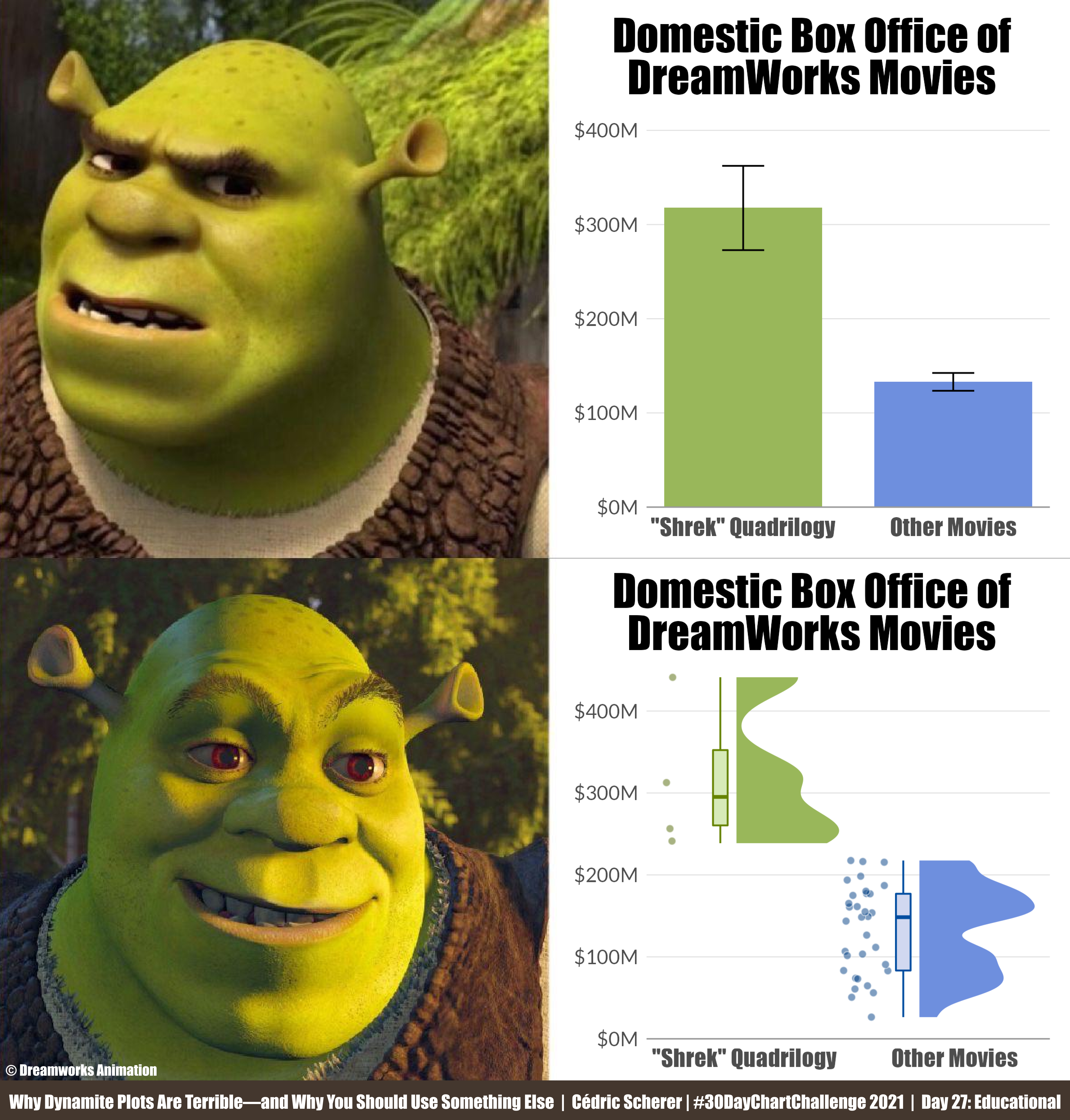
Day 27: Educational
Tools: ggplot2 and Figma
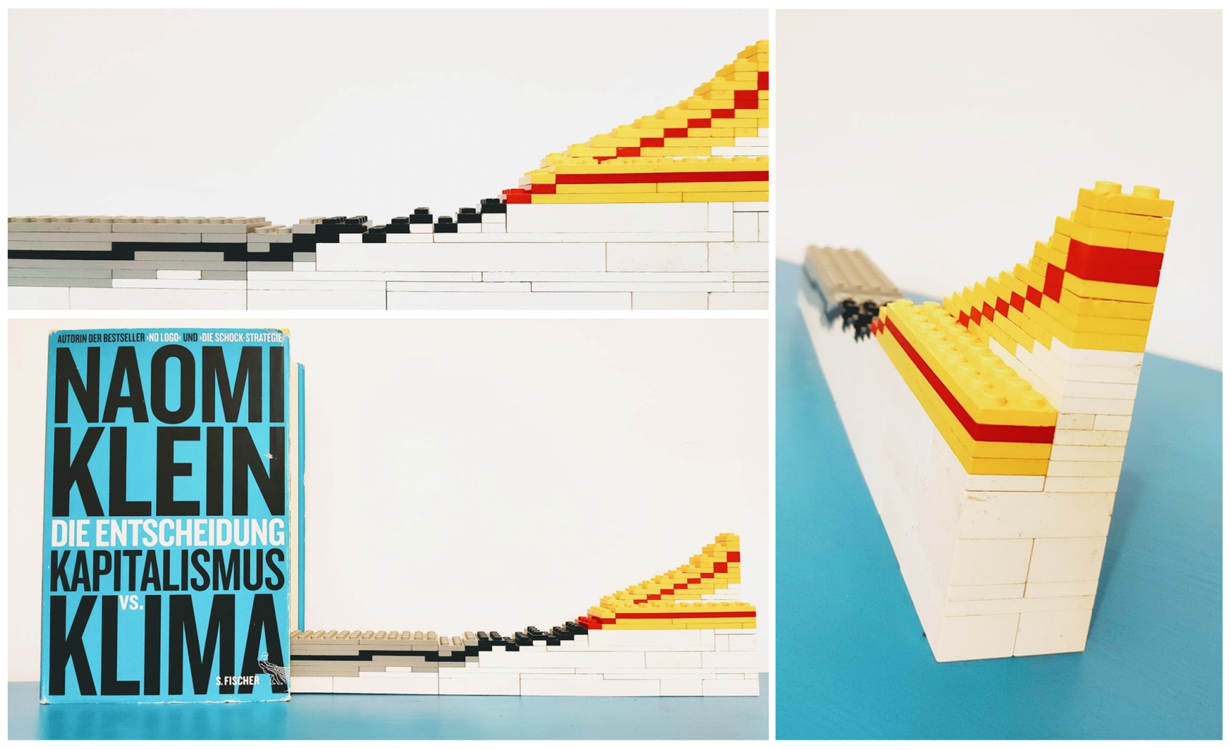
Day 30: 3D
Tool: Lego
Final Thoughts
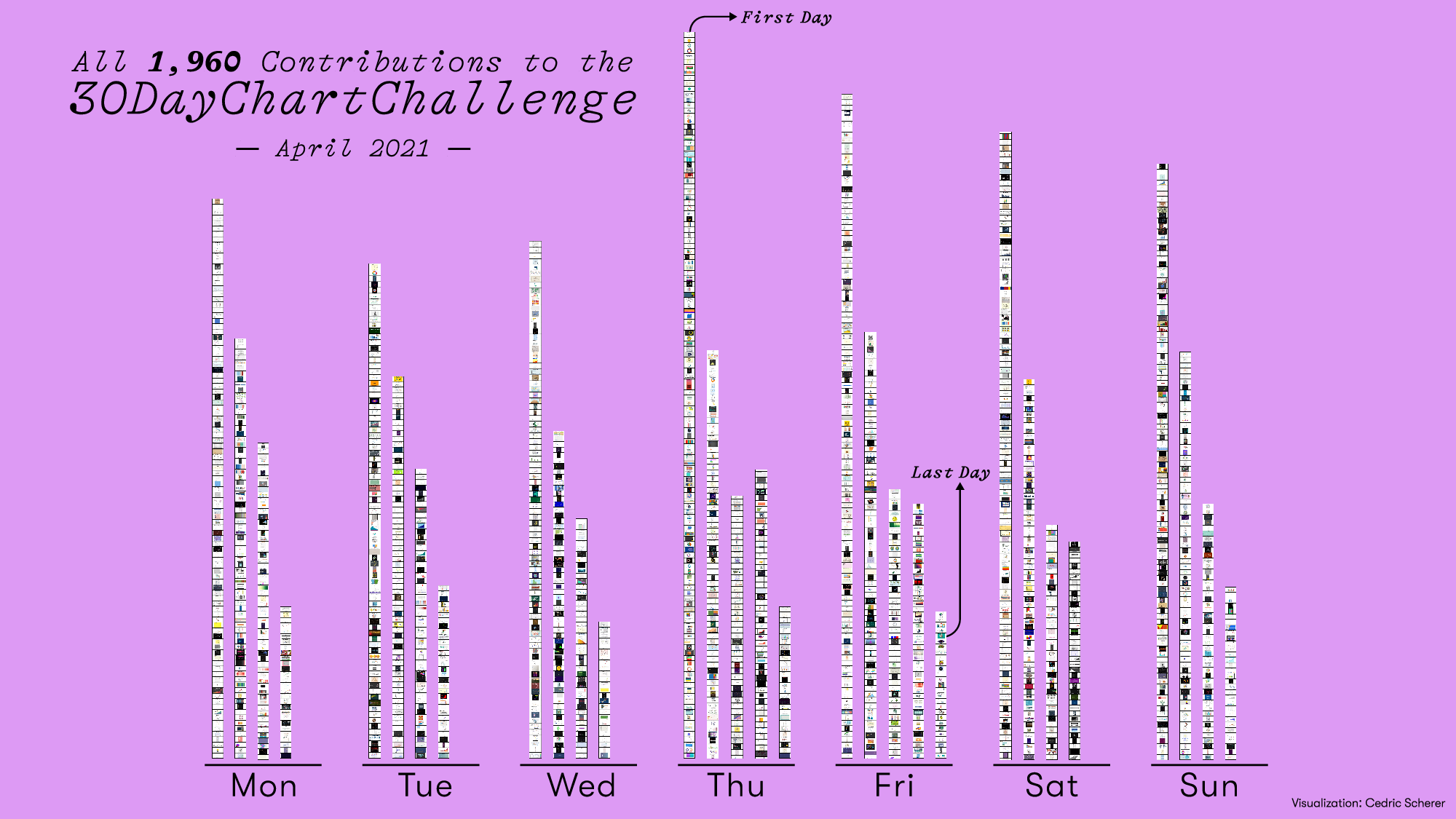
The challenge is over and we are very, very happy about the great success! Thank you everyone for participating in our challenge with a total of 1,960 contributions (and more are still coming in while people are catching up). On the first day, we had the all-time record of 135 contributions!
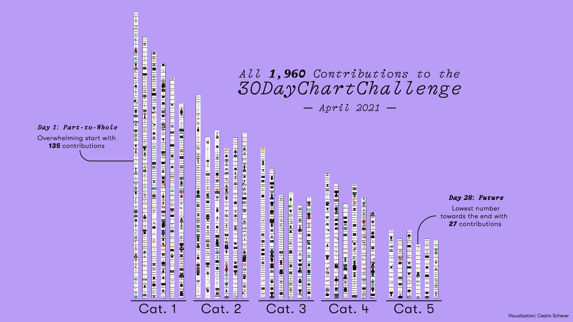
By the way, for more charts about the #30DayChartChallenge, have a look at Georgios Karamanis' collection of meta-contributions.
We have seen contributions from all around the world, using a wide variety of tools. It was also great to see the different approaches and interpretations of the topics. Many participants connected with each other and exchanged tips and tricks on finding data, chart types, and tools.
In personal notes, I am happy that I got to use different tools. Overall, I made 19 out of 30 charts with some drafts and ideas still laying arund. However, I often moved back to R when I realized that some things are not possible in one of the other tools (e.g. I started building the slope chart for day 5 in RAWGraphs but had no clue how to add a few labels, how to scale the colors etc.). I also sometimes had a hard time to move out of R after preparing the data for the other tools—for data preparation tasks R and the tidyverse will be my preferred tool, no interest and/or need to use Excel. So I ended up using {ggplot} way more often than initially planned which was also due to time constraints.
The most difficult part was often to find data for the charts. But also I was more ambitious about both the data and the design than originally planned. While I aimed to make up data, at least from time to time, and focus on tools not the design bits, I had a grad time to remind myself to do so. The every day’s life of a perfectionist I guess ¯\_(ツ)_/¯
You can find all contributions that have been shared on our GitHub repository.
My contributions and codes (in case they were created with/in combination with R) are stored in this GitHub repository.