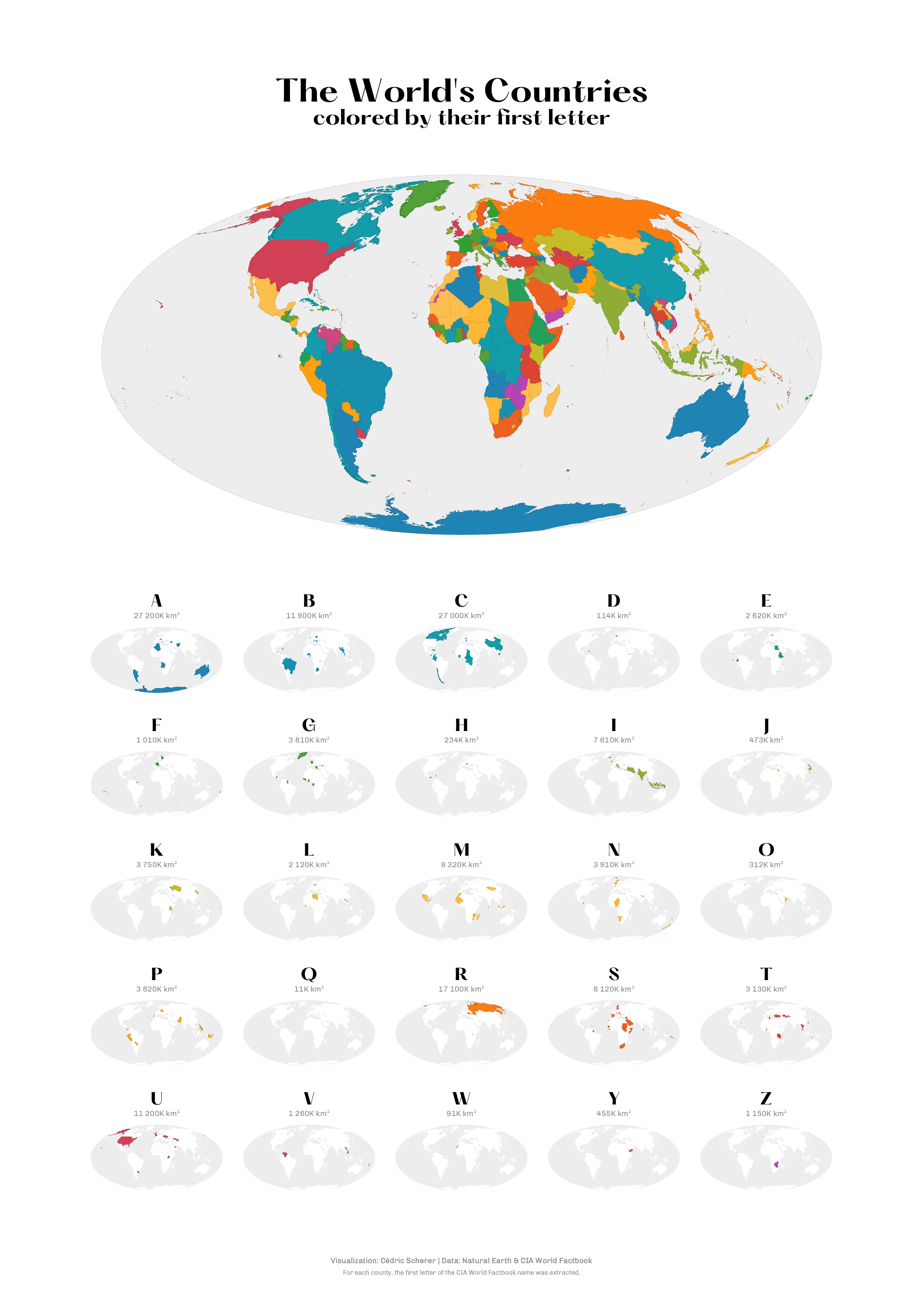
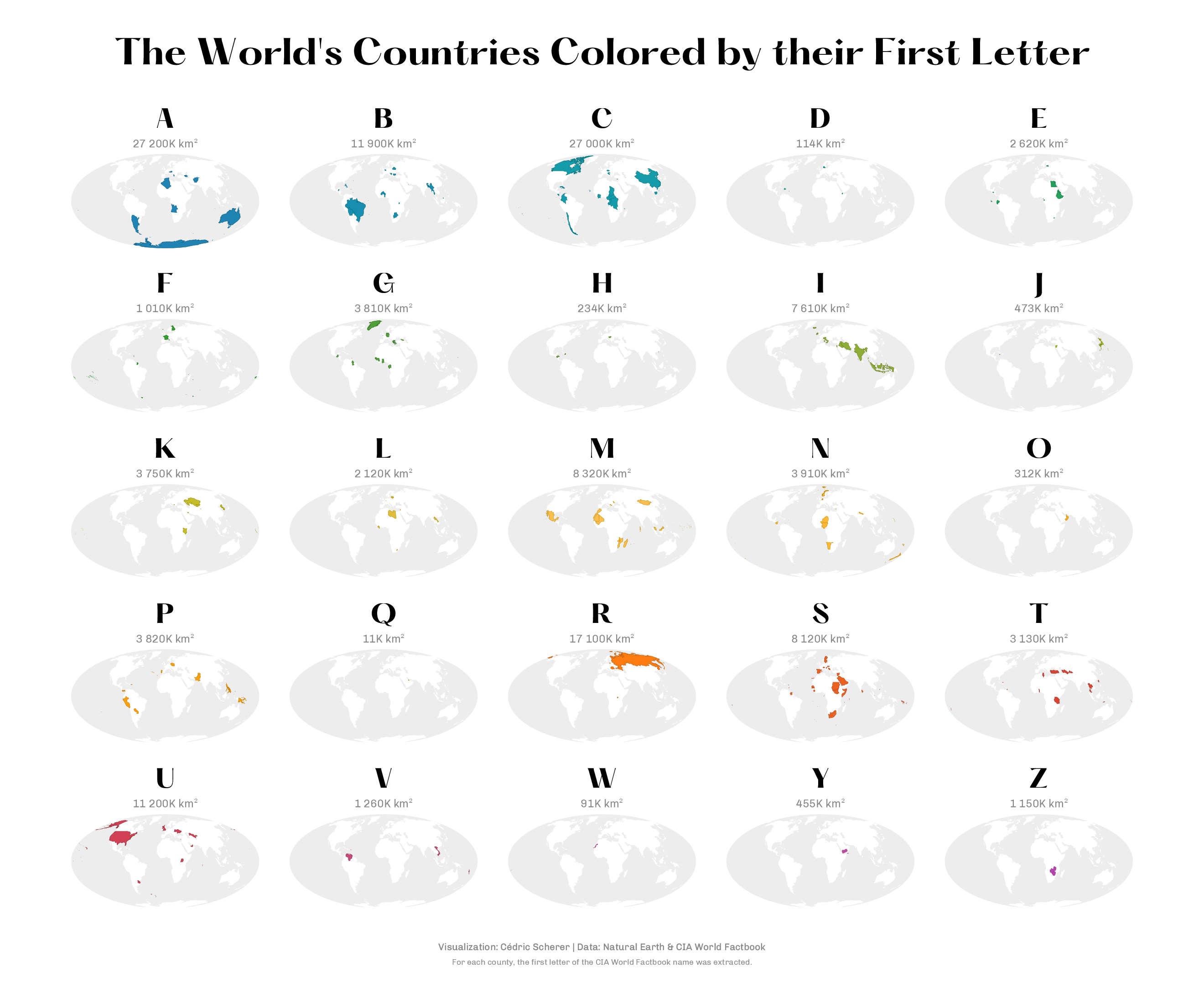
Next month, I am going to give a live training session for Pearson and O’Reilly called “Hands-On Data Visualization with ggplot2”. For this course, I want to cover mapping with R and {ggplot2} for the first time. While searching for a cool variable to illustrate how to create choropleth maps, I came up with the idea to visualize name of each country. But not the full name—that would be too silly and not insightful at all—but the first letter of each country.
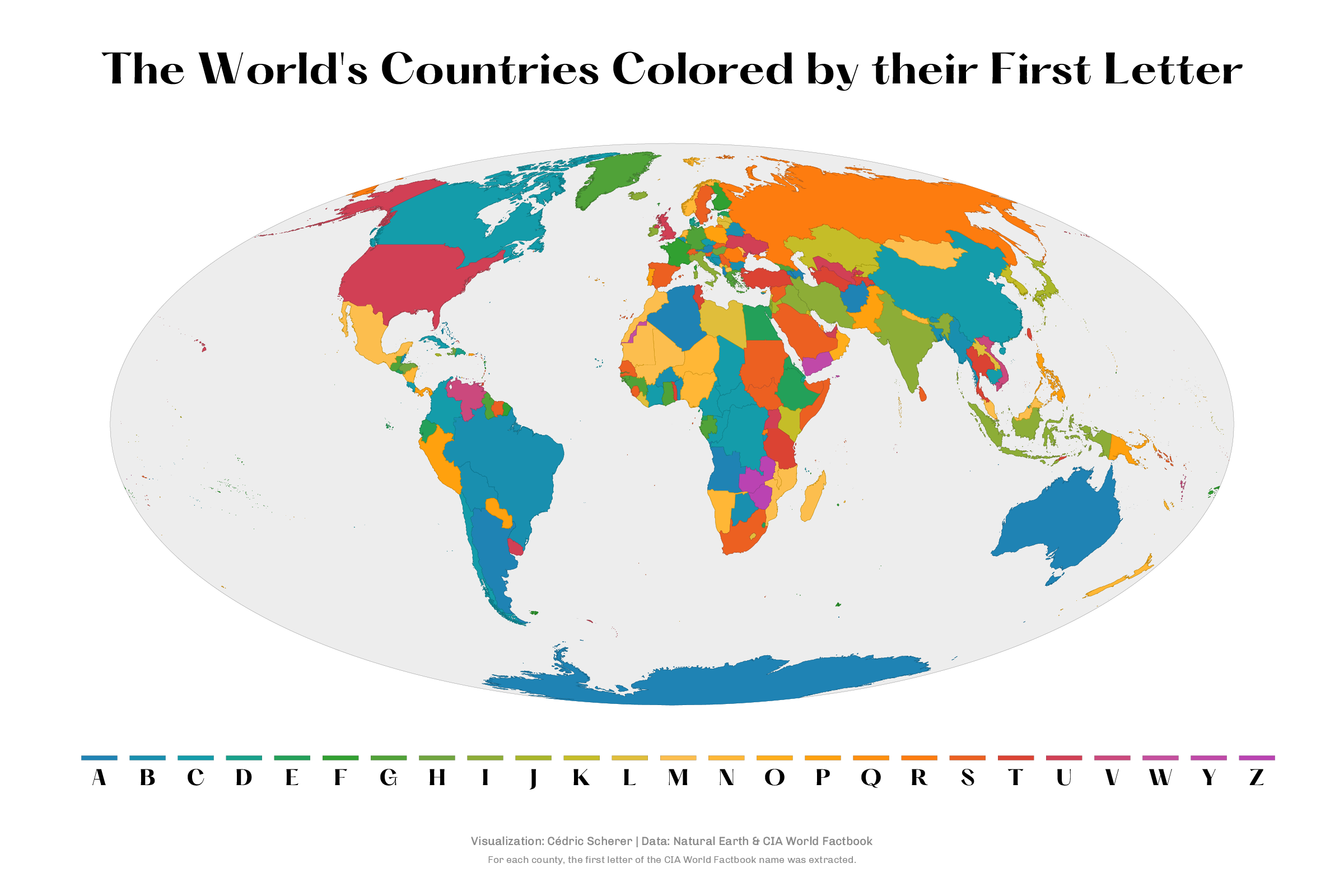
While drafting the first map, it quickly became obvious that mapping color to all 26 letters (or better 25 letters since there is no country starting with X) is not helpful at all. A quick search showed that there are a few colorful maps, struggling with the same problem (here and here) or that do not permit to see the complete data by aggregating rare letters.
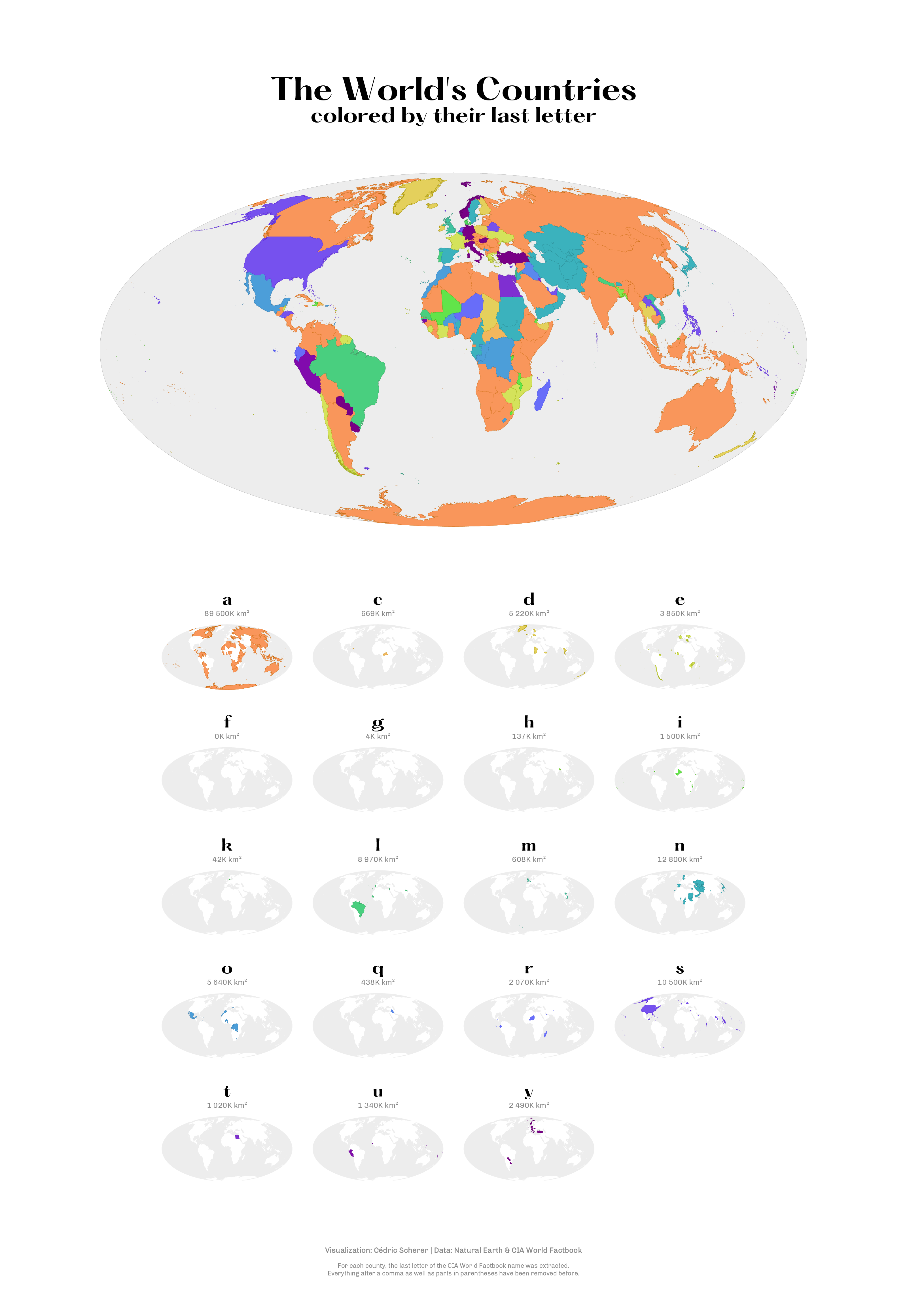
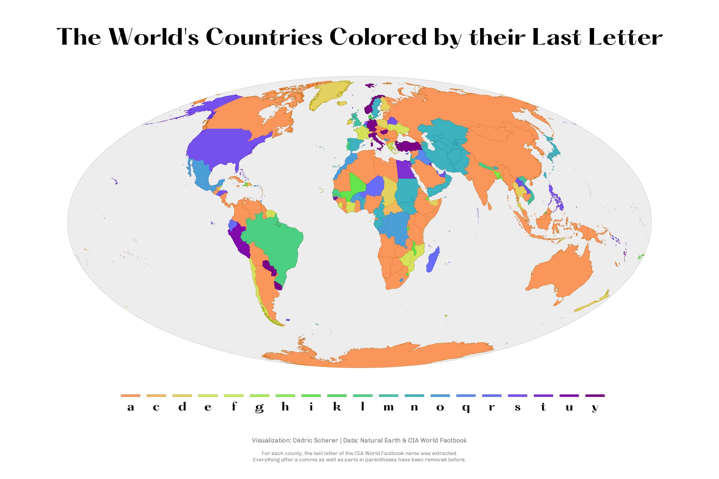
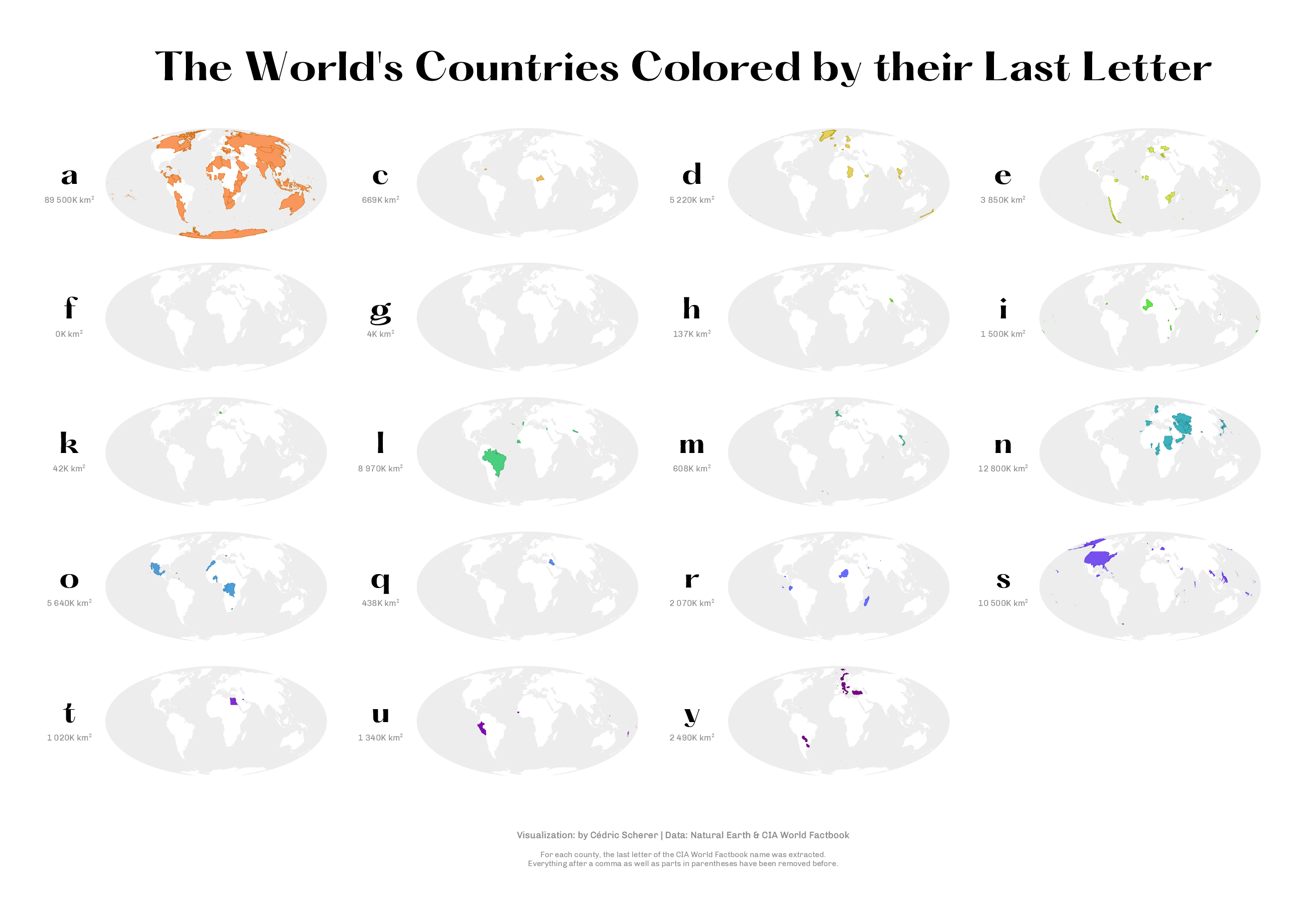
So I quickly came up to use small multiples, which would allow for an easy identification of all countries starting with a particular letter and the landmass covered by these countries. Thanks to {ggplot2}’s facet functionality, it was super–easy to turn it into small multiples.
Project Type
- Personal Project
Motivation
- Finding a cool variable in the NaturalEarth data set to visualize.
- Curiosity: Which letter covers the largest area, which are rare?
Design Choices
- Small multiples to allow for direct access of single letters which allows also to add the area covered to each map.
- A cyclical color palette; of course, 25 categories are too many but with this approach one can at least identify the range a country falls into. Color-vision deficiency problems are likely but not problematic thanks to the small multiples.
- I searched through a ton of fonts: I settled on Hatton for the title and letters and Chivo with its tabular numbers for the areas and the caption.
Data Source
- NaturalEarth for the country boundaries via the
{rnaturalearth}R package - Country names from the CIA World Factbook, contained in the world data set
Tools
- Data:
{rnaturalearth} - Data Preparation:
{dplyr},{stringr}and{sf} - Graphics:
{ggplot2};{ggtext}for title and caption;{patchwork}for plot composition - Colors: Tableau cyclic color palette via the
{ggthemes}
Methods
- I had to choose one source for the names; after checking several naming conventions, I settled on those provided by the CIA World Factbook. Why? Because this was the easiest way to get rid of “Republic” and other prefixes and it has a pretty good coverage.
- For each country, I checked if a name is provided by the CIA world Factbook; if not, I used the sovereignty provided by NaturalEarth.
- For each country in the shape file, I extracted the first letter with the help of the
{stringr}R package from the tidyverse. - For each letter I calculated the area covered with the help of the
{sf}package - Plotting was done completely in R (for a list of packages see “Tools”).
Alternative Versions
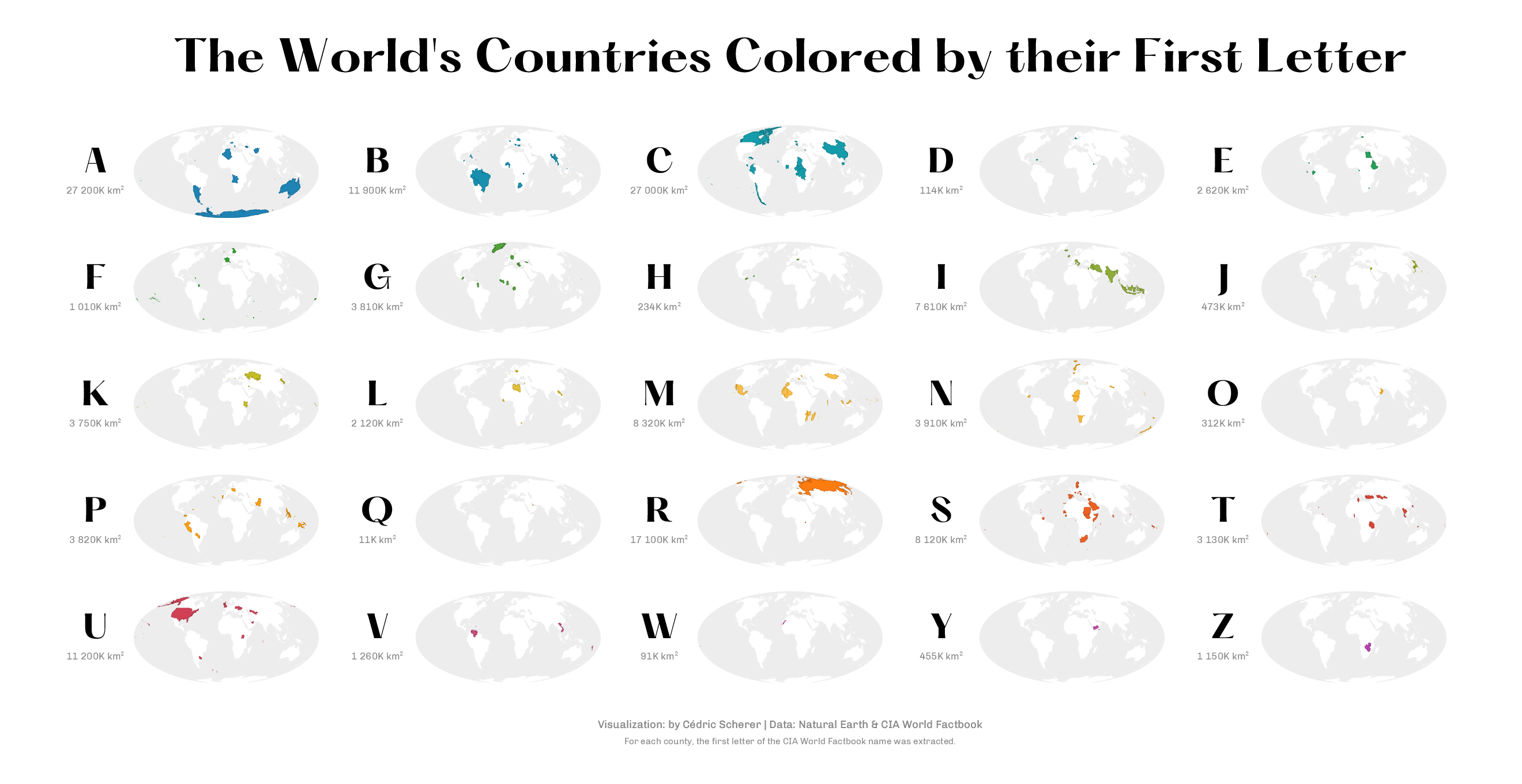
Single Version of the Small Multiples
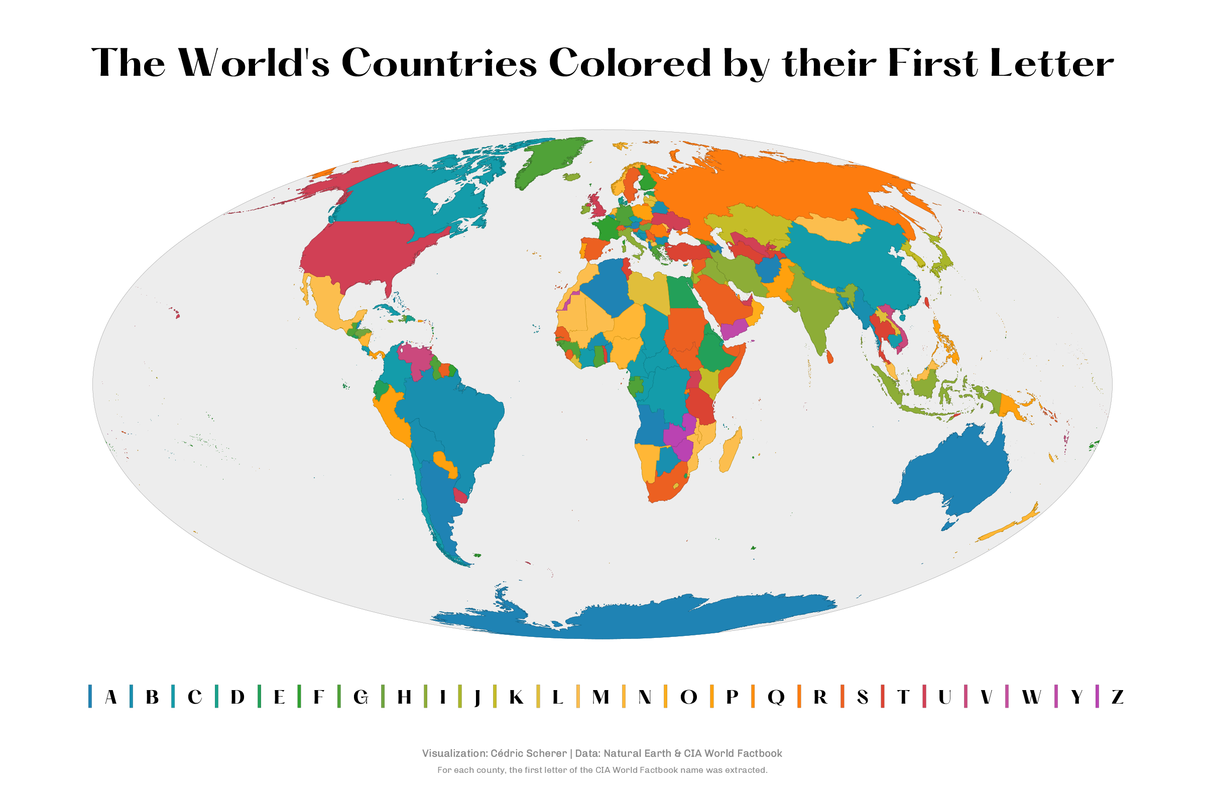
Single Version of the Overview Map
How about the last letter?
Victor asked on Twitter if there is some interesting patterns when looking at the last letter of each country. I had no idea so I went ahead and mapped it. I had to make more assumptions here since several countries in the CIA World Factbook end e.g. with “, Republic of” or something wrapped into parentheses. I decided to remove these bits and pick the last letter of these adjusted CIA World Factbook names.